Friday, 25 January 2013

The Finshed Piece


Here is a pretty bad video 'tour' of the finished piece, but combined with the (also poor) photos, you get a general idea of the whole thing.

Small summery of our project and final outcome for this Options week:

For the theme of Body and Identity we decided to create an installation that represented there can be a divorce between who someone is and what they look like. How they are and can be two completely different things. The old, 'don't judge a book by it's cover' saying.

The booth was the 'template' of our person, our 'characters' exterior would be a beautiful perfection,almost sickly sweet, representing a heightened image of perfection, the idea of beauty only being skin deep. 
The interior would represent a rotten core, their ugly, vain identity on the inside. 


This is the outside, it was painted white, like a blank canvas but with all these ideas of beautiful things being projected/stuck onto it.
Images and scenes of picturesque landscapes, nature, and a close up of a girls eyes blinking, were projected onto it, over white rose petals.
Rose petals and pot puree were sprinkled around the base, giving off a floral scent and we would associate with femininity. 

All these metaphors together were used to project an over-the-top idea what is beautiful and perfect, linking back to Hollister their their projection of the ideal on the customer. In turn also how the media dictates what is considered 'beautiful'. 
Also how the Nazi regime tried to create  the 'perfect race' through Eugenics.

The interior is painted black and the only light is from the small entrance, it is small and claustrophobic, the high black walls around you only enhance this feeling.
Ahead is a lambs heart on a dripping plinth. The smell of the heart is unpleasant, showing the viewer how potentially gruesome and unpleasant something/someone can be on the inside, despite a beautiful exterior (body).


On the walls surrounding are broken mirrors, reflecting back at the audience a jagged, distorted self, making it all slightly disorientating.
These represent a bad, self absorbed vanity, how when someone can be so caught up and self absorbed in their own refection and identity, that they don't have time to notice what else is going on around them. And can "loose one's sense of direction, position, or relationship with one's surroundings".


(Here you can see my refection and then the heart on the plinth in the bottom right shard)

At the base of the heart bearing plinth are melted and distorted Barbie dolls. They have their stomachs and breasts burnt out, some have faces too. This is to  also represent vanity and how destructive it can be. In the search for a vain 'perfection' people can ruin their true pure beauty. Their rotten core had burnt out.


Don't judge a book by its cover, the perfect physical body you see on the outside may have a rotten core to their inner identity.


Saturday, 12 January 2013

The Week of Contruction

So this week has been the week we have to create our installation.
Firstly we had to start thinking about the logistics of the whole thing...


Next, more planning...


And working out the final design...


This is how our week went:

Monday
-Made the plan for the installation (see above)
-Located boards
-Made shopping list and designated out who would purchase what.

Tuesday
-Boards detached and sanded down ready for painting
-Plinth located
-Projector reserved
-Asked/booked in help from the wood work technician to help us construct the boards on Thursday

Wednesday
-Re-evaluated what we had each purchased so far, and decided what else and what more was needed.
I was allocated candles (for creating texture on the plinth), and to look out for cheap mirrors
-Painted boards


 Thursday
-Found a location: the film/tv studio. We marked this up with where we wanted it to be.

The line half way across the left hand side marks where the half board would be, ie. the entrance. The cross marks the plinths location.

However, just as we had moved in all the boards to construction it turned out another group needed the space. We moved to the theatre, but as it was in use that afternoon we had to save setting up for the next day.


-Mirrors were smashed (on an off site location to avoid health and safety and risk assessments)


Friday
-Split into two groups of three, half on the construction of the installation and the other on the decoration. I was in the decoration group.

We started with the plinth, and dripping wax down it to create a sort of messy, horrible texture. We used white and red candle wax, red signifying danger, anger, lust, hate etc. All very strong and potentially malicious emotions. 
This was also done on an off site location to avoid health and safety and risk assessments.


Here is the process and the finished piece. The heart sits in the center, so the red wax will look like the heart is dripping blood.

-Meanwhile, the majority of the booth had been created and the video that Nick had created representing beauty was being set up to be played through the projector.

-Next we glued on the smashed up mirrors into the interior using a glue gun borrowed from wood work, and then the flower petals onto the exterior.

-Then finally the finishing touches, the heart on the plinth went in, the melted Barbie dolls that Charlotte had made went at the foot of the plinth, pot puree and petals were scattered outside, and it was done!

Saturday, 29 December 2012

Rotten Core

 
....A fruit link..
...and an animal link...


Myxomatosis Rabbit

Myxomatosis is a disease that rabbits get that kind of rots them from the inside out, a bit gruesome.


Tuesday, 18 December 2012

Antony Gormley

Antony Gormley is a British sculptor, best known for The Angel of the North. His work mostly focuses on the human figure, often using his own body as a cast to make lead and steel figures.


(http://www.picturesofgateshead.co.uk/angel_of_the_north/index.html)


Here are some of his sculpture works and installations that I think represent the 'divorce between body and soul' that we are going to aim to create in our own space.
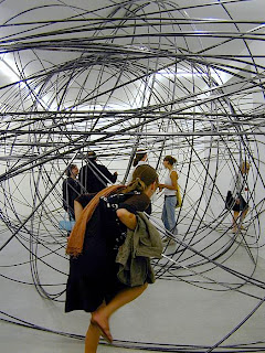
I think the twisted wire inside the human form could represent the inner turmoil of a person, they can look perfectly clam on the outside but swirling round within them can be a mass of confusion, hatred or aggravation.

 STANDING MATTER, GALERIE THADDAEUS ROPAC, SALZBURG, AUSTRIA, 2003
STANDING MATTER, GALERIE THADDAEUS ROPAC, SALZBURG, AUSTRIA, 2003
 FOREIGN BODIES, XAVIER HUFKENS, BRUSSELS, BELGIUM, 2002
FOREIGN BODIES, XAVIER HUFKENS, BRUSSELS, BELGIUM, 2002
 CLEARING, WHITE CUBE, LONDON, ENGLAND, 2004


This installation within a room is also interesting, the twisted metal that fills the room could also represent a twisted, warped mind or soul of a person that the audience has to find their way through.

CLEARING, WHITE CUBE, LONDON, ENGLAND, 2004
NEW WORKS, SEAN KELLY GALLERY, NEW YORK, USA, 2005
CLEARING, GALERIE NORDENHAKE, BERLIN, GERMANY, 2004
SPACETIME, GALLERIA MIMMO SCOGNAMIGLIO, NAPLES, ITALY, 2007


This installation called Blind Light is an enclosed space filled with dry ice and white light, so much so that once you have entered the box it is impossible to even see a hands reach in front of you. The feeling of lost confusion that I imagine one would feel is inspiring for our space. Instead of creating a confusing feel we are aiming to make our audience feel a rotten almost disguisted feel, something that is a complete contrast to the exterior of our space.
BLIND LIGHT, SEAN KELLY GALLERY, NEW YORK, USA, 2007
 
A contrast between a space and its contents. I think this piece is beautiful, not massively related but i really like it.
 FLARE II, SALISBURY CATHEDRAL, SALISBURY, ENGLAND, 2011 - 2012
 
 There is a current exhibition of Gormley's at The White Cube in Bermonsey which would be really interesting to go to and could be quite relavent:


Challenging the physical possibilities of the gallery space, this ambitious exhibition investigates our experience of architecture through the body, and of the body through architecture.
Made in direct response to the space of the South Gallery II is the vast, new work MODEL, which is also the title of the exhibition.  Fabricated from 100 tonnes of weathering sheet steel, the work is both sculpture and building, human in form but at no point visible as a total figure.  Visitors will be able to enter the work through a 'foot' and journey through its inter-connected internal chambers, the sculpture demanding that we adjust our pace and bend our bodies to its awkward yet absolute geometry. The experience of this analogy for the 'dark interior of the body' is guided by anticipation and memory and the direct and indirect light which penetrates the structure and which leads us on, as if through a labyrinth.
The exhibition also includesa room of models - trials mostly made in the year leading up to the exhibition but including some examples from as far back as ten years ago. The room presents a dialogue between dwelling in the body and dwelling in a building and explores the potential of sculture as a form of psychological, reflexive architecture.

There are frames, solid plaster casts and architectural models that map the darkness of the body. Some of the blockworks shown in the corridor have counterparts in the model room, where their solid masses become hollow and form complex interiors. Three models for the interconnecting chambers of the large work MODEL are shown. Throughout the objects and drawings here there is a dialogue between extension and expansion, where the scale of the body is taken as a variable.

The room is a laboratory of possibility, showing the ways in which ideas cross-fertilisze and produce ever more vigorous hybrids. It gives an insight into the workings of the studio as an open-ended exploratory playground in which space and object become interchangeable. 
 
 
I'm going to try and get to it before we start back at uni.


Thursday, 13 December 2012

Beauty is Only Skin Deep

 
http://timmethegreat.deviantart.com/art/Beauty-is-only-skin-deep-91343398


I think this images shows a similar idea to the one we are striving to put across in our own project... 

This also reminds me of this Picasso painting:

 
Weeping Woman ( www.tate.org.uk )  


Also of Nell Allen 'All 4 Him'

https://www.facebook.com/NellAllenArtist 

Thursday, 6 December 2012

Finalising our Proposal

Today we finalised our proposal and set out straight what it is that we are actually going to.

This is what we came up with:

We propose to create a space that represents the idea of how someone appearance is not necessarily their identity. The divorce between body and soul, and to what extent these two inter-link.
This space will have a contrasting inside and outside, which will be divided by flats. Both spaces will be set up to represent the outer body image and the inside identity of a person.

This is a bit of a change from our original starting point, but I suppose ideas develop and change with discussion.We moved away from the idea of creating a disorientating space because whatever tenious link we got to that idea by, we had forgotten.

This new idea has a much clearer link to the theme 'Body and Identity'. We are going to try and represent how a person can look beautiful, happy or pure from the outside, yet on the inside be rotten to the core.

 
(http://fairfieldmirror.com/2012/09/19/fairfield-u-an-apple-with-a-rotten-core/ )


We intend to use flats to create a space within a space, the outside will be the epitome of beauty, and the inside will represent the rotten core of our 'person'. Here's a sneaky sketch of the initial thoughts of how it'll be, baring in mind this is before any research.

 
Good days work of thinking and making things clearer, now just need to begin on a bit of research...


Wednesday, 5 December 2012

Disorientating places?

dis·o·ri·en·ta·tion (ds-ôr-n-tshn)
n.
1. Loss of one's sense of direction, position, or relationship with one's surroundings.
2. A temporary or permanent state of confusion regarding place, time, or personal identity.

 Took a trip to CyberDog in Camden today. CyberDog, like Hollister has a similar kind of 'club' atmosphere to it, but in a more rave way.

Here are some sneaky pics of inside:


 (pics taken 4/12/12)

Electronic music pumping, UV lighting making the florescent clothing glow and all the shop assistants dressed as if they were about to head out of a bit of happy hardcore raving.  

I don't know whether I would class CyberDog as disorientating, more as intense, I felt like I should be donning some neon and going out, not just casually browsing.  


This got me thinking about other places I've found disorientating. I have one strong memory of as a child getting lost in a mirror maze on a school trip. It was Wookey Hole Mirror Maze.

 http://www.tripadvisor.in/ShowUserReviews-g635922-d213489-r124745619-Wookey_Hole_Magical_Mirror_Maze-Wookey_Hole_Wells_Somerset_England.html 
(5/12/12)


I remember being so completely lost, confused, alone and scared. Running into myself over and over and finding no one I knew, or any means of escape. Just faced with my own reflection. 
Completely disorientating.